LIFT Study 01 · No Kill Switch Research Programme
LIFT
The case for Lifesaving Intervention Flight Technology to improve survival from out-of-hospital cardiac arrest.
Read the case
LIFT Study 01 · No Kill Switch Research Programme
The case for Lifesaving Intervention Flight Technology to improve survival from out-of-hospital cardiac arrest.
Read the caseThe Opportunity
| Number | Caption |
|---|---|
| 17.9M | Global cardiovascular deaths each year, the world's leading cause of death and ~32% of all deaths (WHO). Sudden cardiac arrest accounts for an estimated 2 million of these. [observed]
|
| ~13% | Survival to 30 days when paramedics reach a NSW cardiac arrest patient and attempt resuscitation. Below 1% if defibrillation arrives too late. [observed]
|
| Up to 100× | Underfunded: Australian cardiac-arrest research relative to comparable causes of death (Pointon 2026). [derived]
|
Cardiac arrest is the most lethal cardiovascular event a person can experience, and the most time-sensitive. Every minute without defibrillation costs 7 to 10 percentage points of survival. After ten minutes, the chance of walking out of hospital is close to zero.
The scale is not in dispute. The World Health Organization estimates 17.9 million cardiovascular deaths each year globally, the leading cause of death worldwide and ~32% of all deaths. Sudden cardiac arrest accounts for an estimated 2 million of these. Each country reports against its own surveillance system and data validity varies; the figures below are framed against the highest-quality available source for each jurisdiction.
In Australia, the Australian Institute of Health and Welfare (AIHW) records approximately 30,000 out-of-hospital cardiac arrest (OHCA) events per year. The Australasian Resuscitation Outcomes Consortium (Aus-ROC) binational registry, the most rigorous comparable data available, captured 26,637 Australian OHCA events in 2019. Only 43% received an emergency medical services (EMS) resuscitation attempt. Of those, only 13% survived to hospital discharge. Across the whole denominator, fewer than 6% survived.
In New South Wales the cascade narrows further. Taking the population share of the national volume, around 8,500 OHCA events occur each year. Paramedics attempt resuscitation on around 3,500. Fewer than 500 survive to thirty days. The NSW Ambulance Out-of-Hospital Cardiac Arrest Registry holds the granular figures but does not expose them to programmatic access; published reports confirm the cascade shape. Survival is highest where the arrest is shockable, witnessed, and reached early, and falls precipitously where any of those three conditions fails.
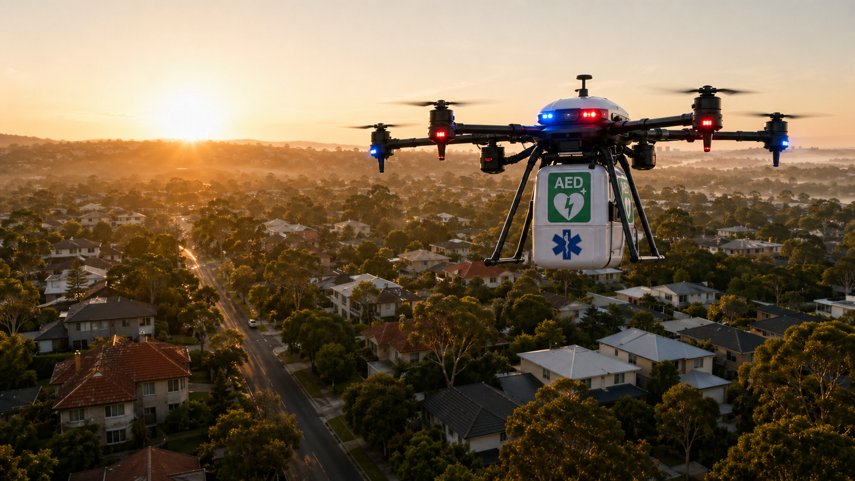
Automated external defibrillators (AEDs) work at every link in the chain of survival; the science of early defibrillation has been settled for two decades. What is missing is delivery. Bystander defibrillation before EMS arrival is associated with 53% 30-day survival for shockable rhythms, against 16% without (Hasselqvist-Ax 2015). The 2022 Schierbeck case in the New England Journal of Medicine showed a drone-delivered AED restoring a patient's rhythm in suburban Sweden before paramedics arrived.
The gap is investment in the levers that close the time-to-shock window. Two pre-EMS levers remain dramatically underfunded relative to disease burden: early arrest detection and early defibrillation. The Coute 2017 US National Institutes of Health (NIH) analysis put cardiac-arrest research at ~$91 per annual death, 20× less than heart disease and 24× less than stroke. The Pointon 2026 Australian analysis reaches the same conclusion: cardiac arrest is underfunded by up to a factor of 100 relative to other leading causes of mortality. Almost all of what is funded targets prevention or post-arrival hospital care. The first four minutes, where the survival curve is steepest, are largely uncontested research territory.
The challenge is to put a defibrillator on a patient's chest before the curve runs out.
The Solution
| Number | Caption |
|---|---|
| ~4 minutes | Drone target time-to-AED for a typical Sydney suburban location, against ~8.5 minutes for the NSW Ambulance Category 1 (Cat 1, life-threatening) median. [modelled]
|
| 2022 | The Schierbeck case (New England Journal of Medicine): a drone-delivered AED restored a patient's rhythm before paramedics arrived (Sweden). [observed]
|
| Aeromedical-grade | Independent specialist operator modelled on the Special Operations Team search-and-rescue (SOT SAR) and Toll Aviation precedents, integrating with ambulance Aeromedical Operations. [design]
|
The clinical mechanism is settled; the delivery model is ready to test. The science of early defibrillation has been settled for two decades. What is missing is delivery.
A drone-delivered AED closes the four-minute window. From a network of bases co-located with ambulance stations across the three Remoteness-Area tiers (Metro, Regional, Rural), an autonomous airframe carrying an AED can reach a residential cardiac-arrest scene in roughly 3.6 to 4.4 minutes, including launch delay and descent. The NSW Ambulance Category 1 (Cat 1, life-threatening) median is ~8.5 minutes. The drone arrives during the steepest part of the survival curve.
International precedent is sufficient to justify a NSW pilot, though not yet sufficient to assume NSW outcomes. Sweden's Karolinska and Everdrone programme has documented drone AED delivery beating ambulance arrival in real suspected-OHCA cases (Schierbeck 2023, Lancet Digital Health). Wing operates autonomous beyond-visual-line-of-sight (BVLOS) commercial delivery in Logan, Queensland within the broad Civil Aviation Safety Authority (CASA) Part 101 RPAS regulatory family, but its commercial-delivery approval does not transfer to AED-OHCA dispatch; LIFT will require a dedicated BVLOS / SORA safety case for medical-payload dispatch over populated suburbs. Manna runs autonomous medical-adjacent delivery in Dublin under a Specific Operations Risk Assessment (SORA)-equivalent regime. Zipline has flown approximately one million medical deliveries across Rwanda, Ghana, and the United States.
The Australian regulatory pathway for medical-payload BVLOS is open but not closed. The pilot will need to clear, in sequence, a documented set of gates rather than borrow from existing commercial-delivery approvals.
The LIFT operating model is built to integrate with existing ambulance Aeromedical Operations the way specialist aviation contractors already do. NSW Ambulance Aeromedical Operations contracts Toll Aviation for helicopter retrieval and integrates with the Special Operations Team (SOT) for search-and-rescue capability. LIFT proposes a structurally similar arrangement. An independent specialist operator runs the drone-AED service. NSW Ambulance Aeromedical Operations dispatches it through the same Cat 1 escalation pathway it already uses for helicopter retrieval. The operator is responsible for airframes, pilots, CASA approval, clinical-evidence generation, and SORA-AU (the Australian SORA variant) iteration. The ambulance service is responsible for the call, the dispatch decision, and the on-ground response.
The mission flow below is a target operating concept, not an existing dispatch extension. From the caller's perspective the experience would be largely unchanged; the operational, governance, and medico-legal design behind it has yet to be co-designed and agreed.
The pilot is designed to minimise, but still requires validation of, additional control-room, dispatch, and governance load. Open questions for co-design with NSW Ambulance include:
The independent-operator structure is deliberate. It enables LIFT to integrate with multiple ambulance agencies on similar terms, the way GoodSAM operates as a global volunteer-responder layer alongside dozens of EMS systems. It preserves a single regulatory voice with CASA. It allows the figure pipeline, evidence base, and operating procedures to be reusable across jurisdictions: NSW first, the next Australian state second, the first international ambulance partner third.
The Impact
| Number | Caption |
|---|---|
| 21–86 | Additional NSW lives saved per year at three-tier full coverage (LIFT model, sensitivity envelope). [modelled]
|
| $450–$5,500 | Cost per quality-adjusted life year (QALY), against $30,000 to $55,000 for fixed public-access AED programmes. [modelled]
|
| $0.55B–$2.28B | Australian Government Value of Statistical Life (VSL) public benefit, five-year envelope. [modelled]
|
The direct impact is lives. The LIFT survival-impact model projects 21 to 86 additional lives per year across NSW at full three-tier coverage. The model is built on Valenzuela 1997 decay parameters, Hasselqvist-Ax 2015 bystander-defibrillation outcomes, and Schierbeck 2023 real-world drone-delivery time savings. The range reflects bystander-retrieval-rate uncertainty (the largest single sensitivity in the model) and ±20% variance on the survival decay parameter.
The early modelled economics are favourable across tested assumptions, but they are screening-level feasibility numbers, not decision-grade cost-effectiveness. Cost per QALY of $450 to $5,500 sits below typical Australian public-access AED programmes ($30,000 to $55,000 per QALY) and below thresholds the Pharmaceutical Benefits Advisory Committee (PBAC) routinely accepts for new pharmaceuticals. At an Australian Government VSL of $5.3M per statistical life (2022 dollars), the five-year public benefit envelope is $0.55B to $2.28B against a fully-loaded operating cost of $4.5M to $6.0M.
The closest published peer-reviewed cost-effectiveness comparator, Maaz 2025 (Resuscitation 209:110552), reports a smallest non-dominated network at $20,912 per QALY using a Markov microsimulation with full age-by-year quality adjustment and treatment-pathway costs. The LIFT range is materially lower because the model uses a simpler fixed-QALY assumption (10 QALYs per life saved) appropriate for early screening but not for procurement; the LIFT economics also exclude implementation overhead, deadweight loss of taxation, and discounting. NSW registry data, full operational costing, and independent health-economic review would refine these numbers before they become decision-grade.
The modelled assumptions visible to a sceptical reader: bystander retrieval rate (the largest single sensitivity), QALYs per life saved, drone operating cost, weather availability, dispatch-to-shock interval, and discount rate. Each is documented in the deep evidence pack with provenance labels.
The indirect impact is the seed of digitally-enabled emergency health. The same dispatch-integration architecture that hosts the drone operator's pilot can extend the pattern to other low-density, high-stakes interventions where device-to-patient delivery is the constraint. Examples: rural anaphylaxis adrenaline, paediatric seizure rescue medication, post-partum haemorrhage drugs in remote communities, opioid-overdose naloxone in dense urban settings. None of these need a new control architecture. They need the drone-AED proof of concept to land first.
The system effect is bigger than the sum of OHCA lives. The first ambulance agency to adopt this model would be among the first to operate a defibrillator-delivery network as part of a routine dispatch pipeline (the global scan that would confirm "first" is documented in the deep evidence pack). The first integrated road, air, and virtual clinical-care surface for emergency medicine becomes operationally real. The clinical evidence (survival outcomes, time-to-shock distributions, bystander-coordination data) generates publishable research. That research is structurally absent from current registries because the intervention itself does not yet exist at scale.
The OHCA case is the wedge. The platform is the long-run impact.
The Recommendations
"Procure the capability as a service from a specialist operator, the way ambulance services already contract aeromedical helicopter capability today."
The evidence supports moving from feasibility to a funded three-site three-tier pilot. The structure is built for fast adoption. An independent specialist aviation operator runs the service on the SOT SAR and Toll Aviation pattern, integrating with NSW Ambulance Aeromedical Operations, and designed from day one for multi-agency expansion.
Three sites calibrated to NSW's three Remoteness-Area tiers, each producing a substantively different evidence base.
Five-year operating-loaded envelope: $4.5M to $6.0M, dropping toward $0.3M to $0.6M at autonomous-with-dispatcher-oversight scale. Public benefit at Australian Government VSL: $0.55B to $2.28B (modelled, screening-level; reconciled against Maaz 2025 in the Impact section).
Procure the capability as a service. The pilot adds drone airframes, AED units, Drone Remote Pilot staffing, CASA Part 101 BVLOS approval, and a clinical-governance framework that reports into the existing NSW Ambulance Clinical Quality programme. The pilot is designed to avoid a separate public-facing emergency access point and to minimise new control-room burden, but it still requires NSW Ambulance validation of dispatch integration, RPAS monitoring responsibility, clinical-script governance, privacy logging, and adverse-event review. The first jurisdiction to adopt this model becomes among the first to operate a drone-defibrillator service inside its routine Cat-1 dispatch pipeline.
Back the operating company, not the pilot. Capital deployed at the company level captures the multi-agency expansion surface; capital deployed at the pilot level captures only the founding pilot's investment return. The early modelled unit economics are favourable across tested assumptions: $450 to $5,500 per QALY (screening-level) against a fixed-AED comparator at $30,000 to $55,000, and a closest-comparable peer-reviewed benchmark of $20,912 per QALY (Maaz 2025). NSW registry data, full operational costing, and independent health-economic review would convert these numbers from screening-level to decision-grade. The same regulatory approval, drone-airframe operating capability, and dispatch-integration pattern enables follow-on ambulance partnerships in other Australian states. International expansion follows on the GoodSAM-style global model. The platform also opens follow-on medical-payload markets: rural anaphylaxis adrenaline, paediatric seizure rescue, post-partum haemorrhage drugs, blood-product rural supply, sample-transport logistics.
Five research questions sit at the front of the pilot, each mapped to publishable, National Health and Medical Research Council (NHMRC) and Medical Research Future Fund (MRFF) grade evidence within the Cardiovascular Health Mission funding envelope. The questions: bystander retrieval rate; tier-stratified time-to-shock distribution; public trust in autonomous medical drones; integration with the GoodSAM volunteer-responder layer; CASA SORA-AU iteration. Outputs feed Aus-ROC registry datasets directly.
Begin the conversation.
The Evidence
The case rests on primary sources and a transparent model. Every headline number on this page is anchored to one of: the World Health Organization, the AIHW, the Aus-ROC binational registry, the NSW Ambulance Out-of-Hospital Cardiac Arrest Registry, the Coute 2017 NIH funding analysis, the Pointon 2026 Australian funding analysis, the Hasselqvist-Ax 2015 Swedish bystander-defibrillation cohort, the Schierbeck New England Journal of Medicine and Lancet Digital Health drone series, and the LIFT spatial-impact and cost models built on those inputs.
The deep evidence pack contains the full chapter set: spatial demand analysis, three-tier coverage modelling, survival-impact decay curves, hardware and operations shortlist, fully-loaded cost bill of materials, risk register, and methodology appendix. It is published as an open consultation draft under CC BY 4.0.
Every quantitative claim in this study traces to a named primary source via the source-audit appendix. Provenance labels (observed, derived, modelled, synthetic) sit beside each headline number in the deep evidence pack. The synthetic-data layer is being retired in favour of named-source estimates derived from observed registry inputs. NSW Ambulance Cardiac Arrest Registry sub-state extracts and Service NSW GoodSAM AED registry exports are the two restricted data feeds the pilot would unlock; partnership letters are drafted and ready.
An independent feasibility study by the No Kill Switch Research Programme, in conversation with NSW Ambulance practice.
The References
Primary sources for the headline numbers and case-precedent citations on this page. Full bibliographic detail for the wider evidence base sits in the literature review and the machine-readable bibliography at content/references.bib in the source repository.